Introduction
Vision
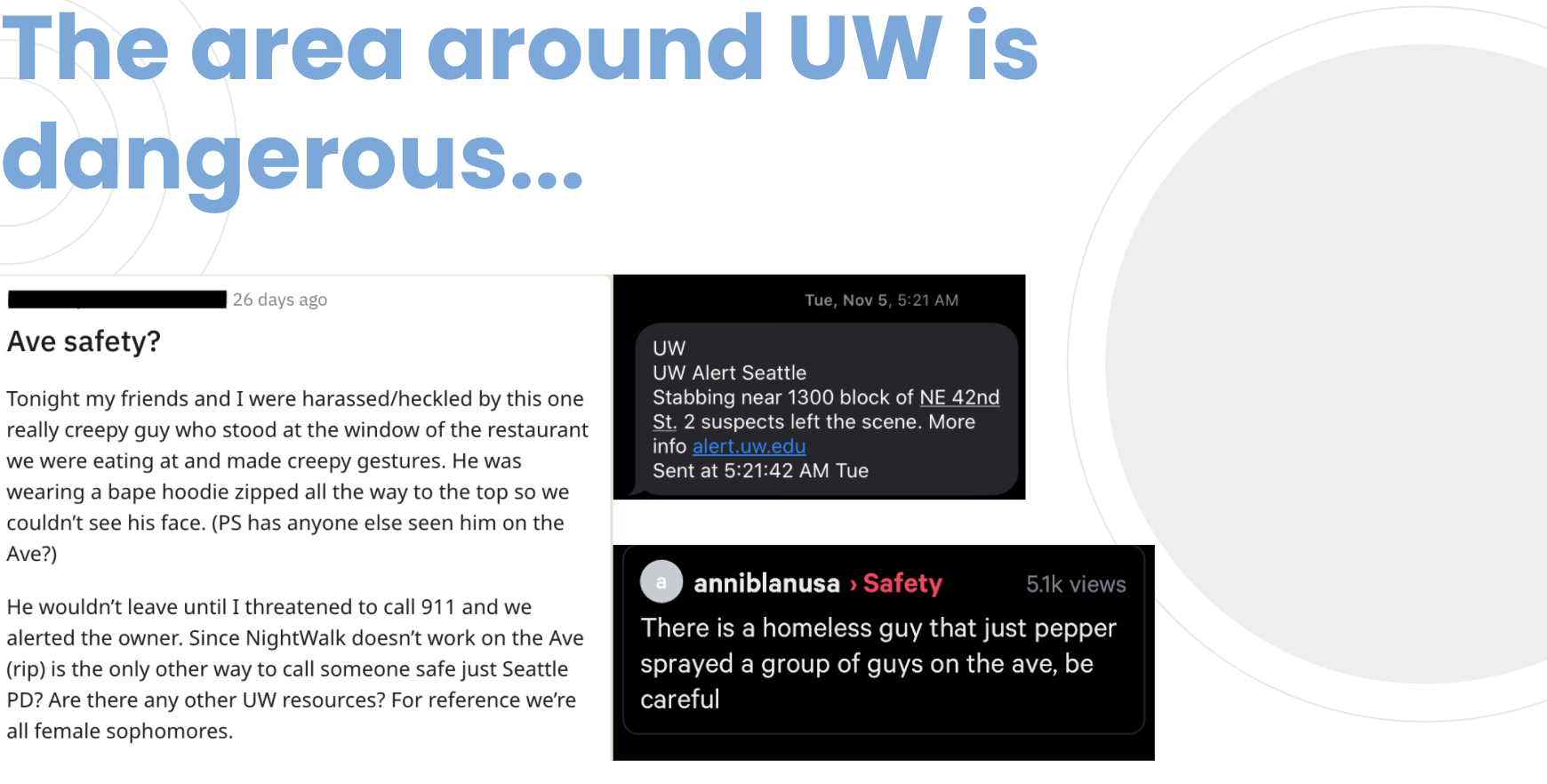
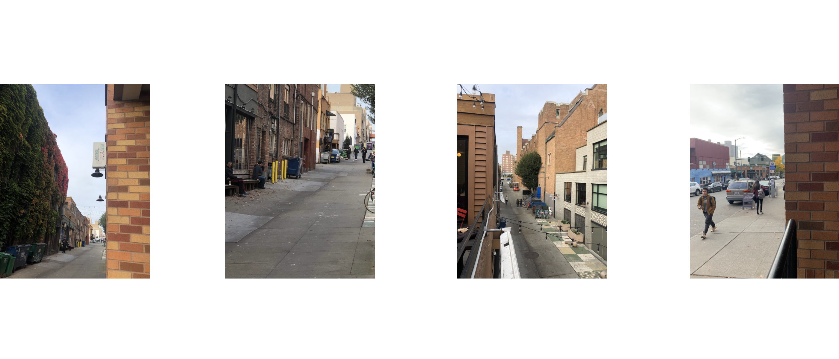
Many University of Washington students live in apartments near campus. Of these apartments, many are located on University Way NE (the Ave). Unfortunately for commuters, this street is known for being dangerous, with frequent reports of criminal activity. Furthermore, Seattle has a high rate of homelessness, which adds to the Ave's negative perception. Understanding this situation, we decided to focus our efforts on improving students' experiences when commuting between their apartment and the university.
Context
This project was completed in a group of 4 people over 10 weeks as part of Introduction to User-Centered Design, an upper-level undergraduate course in the Human-Centered Design and Engineering department. We followed an iterative design process that eventually resulted in us creating high-fidelity mockups for "Watchful Walking," an app that helps the University of Washington students feel safer while commuting University Way NE.

Research
Qualitative Research
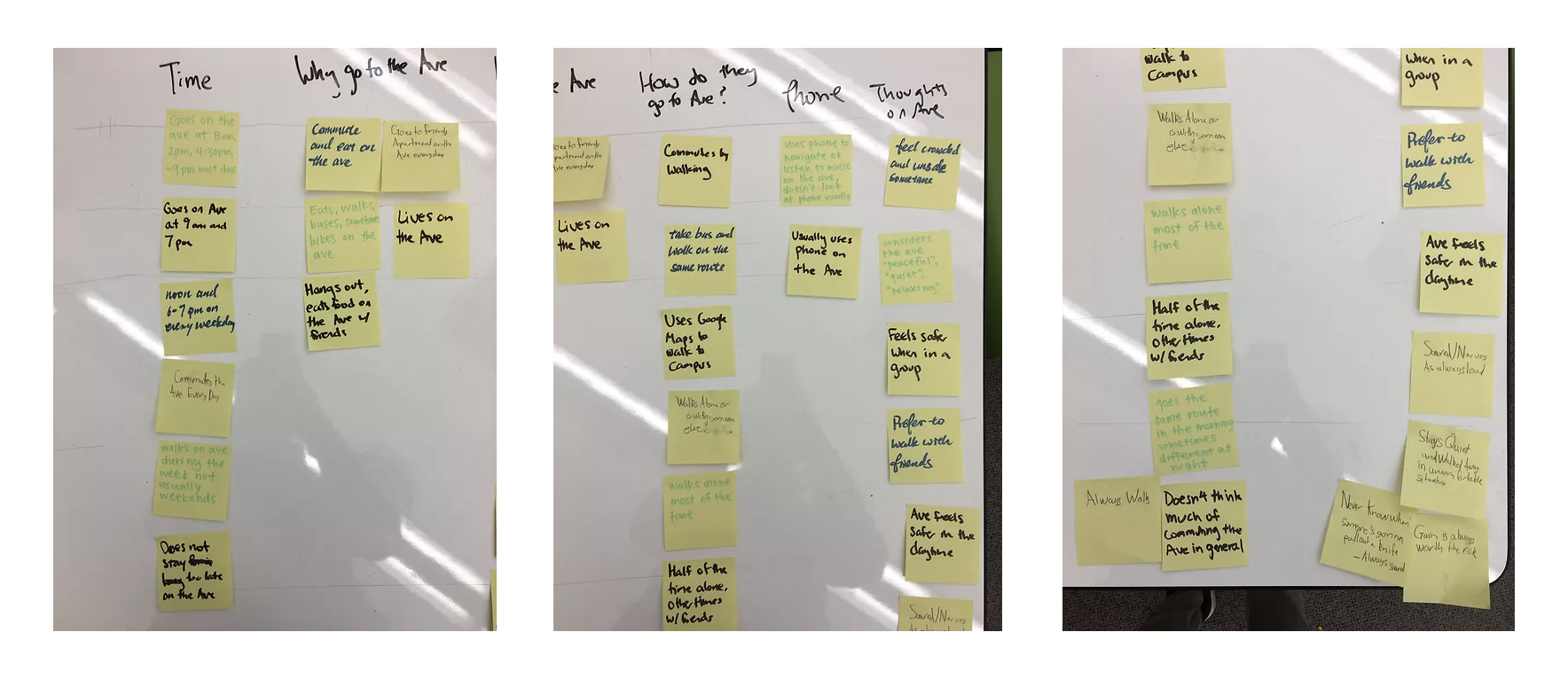
To empathize with our target users, we conducted user research with the University of Washington students who live in apartments near the University of Washington and commute by walking. User research helped us understand user motivations, goals, desires, and pain points when commuting.
Insights
1. Most students who have to commute on the Ave feel unsafe at night.
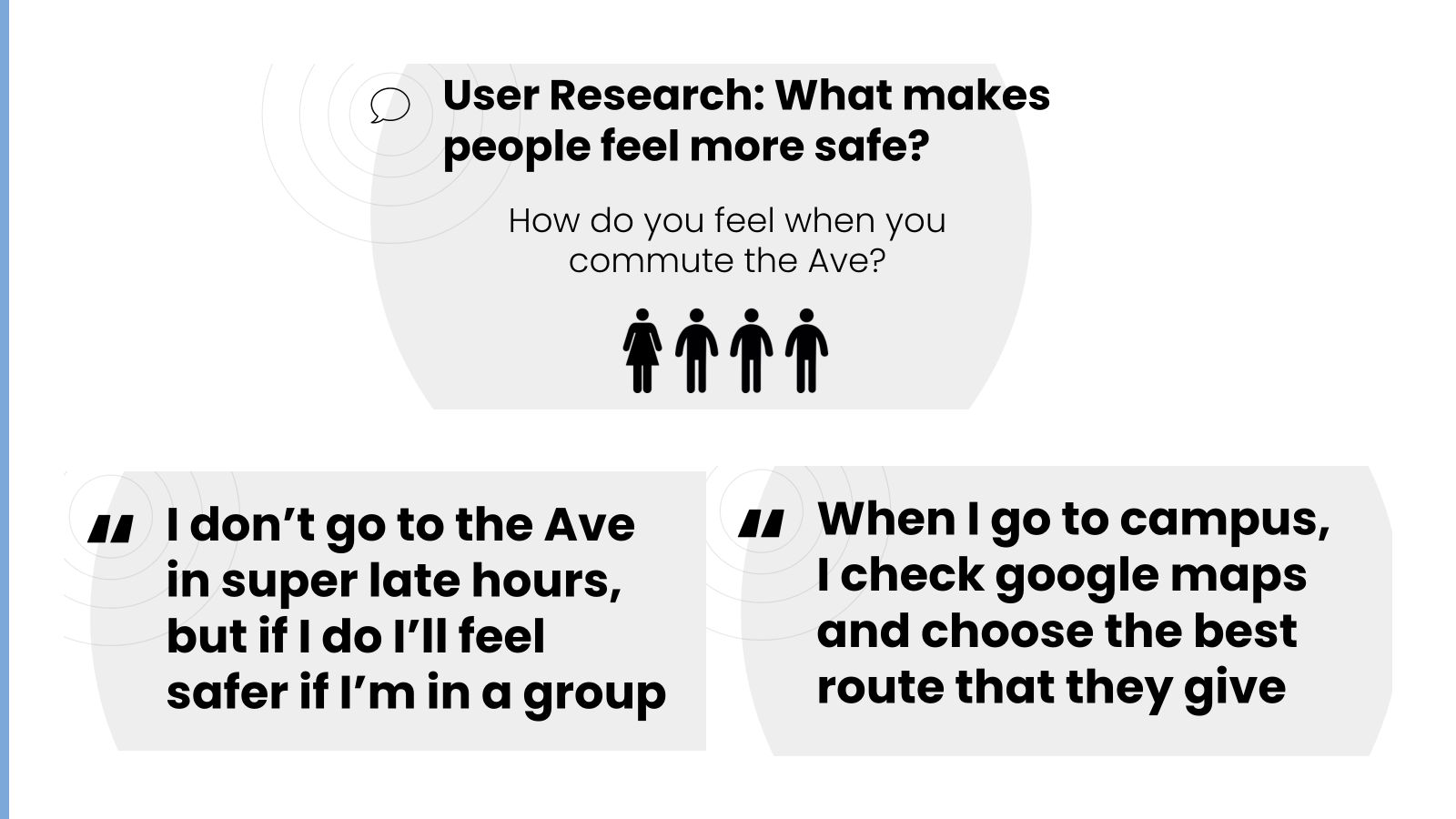
2. If they have company, they feel much safer.
3. Students have trouble knowing where parts are dangerous.
4. When they want to check the map, they can only get the route recommended by google maps.
How might we

Analysis
User Persona
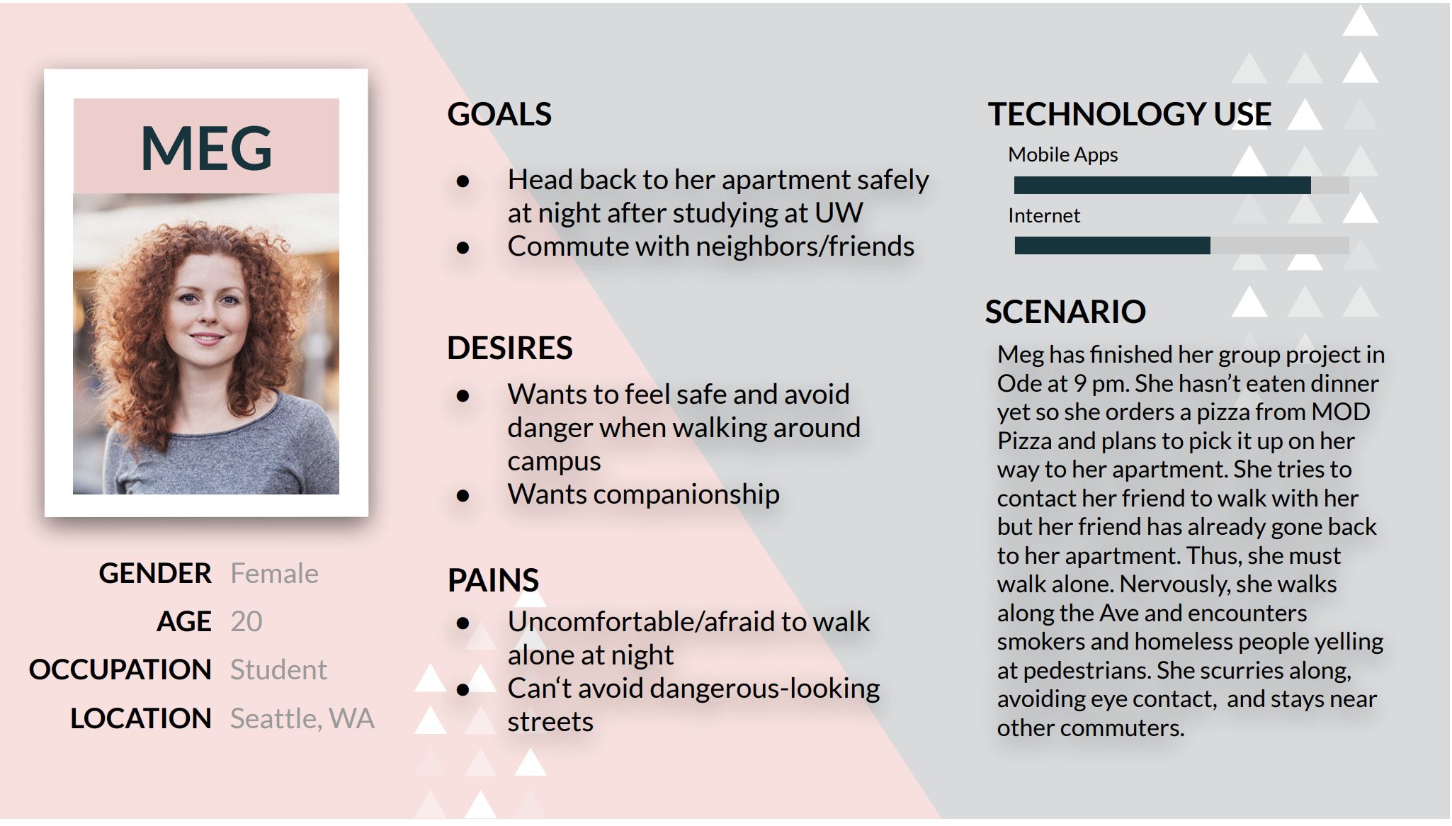
Based on the research findings, we created a user persona to help us understand our user group and organize their projected characteristics and motivations. We decided on a scenario for a possible experience that our target users might go through from our user research. This scenario served as the timeline for our user journey map.
User Journey Map
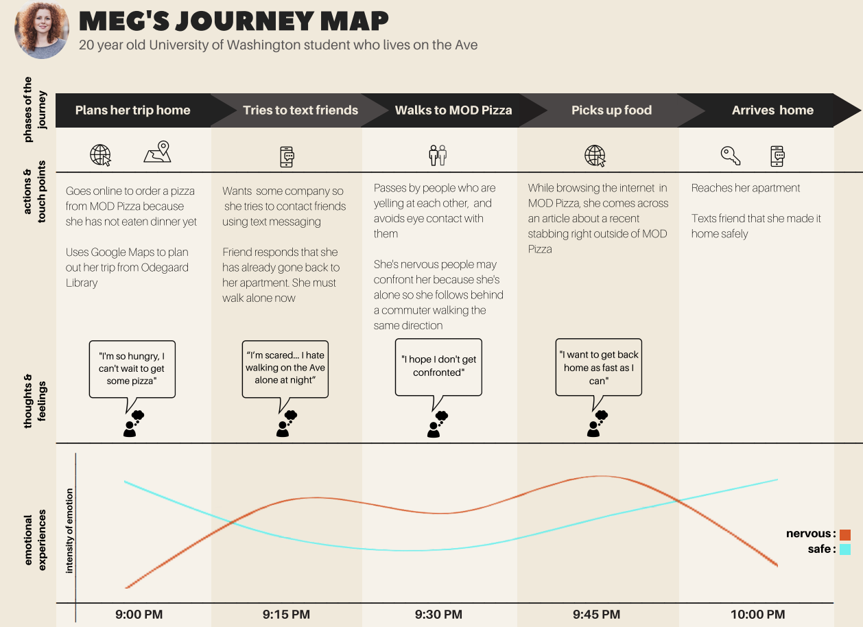
We created our user journey map based on the personas. The plan focuses on the user's emotional experience as they follow each phase in the scenario. The map helped orient our design thinking with the user's context. The journey map also reminded us to prioritize our users' needs and actions before our biases. After aligning ourselves with the user group, we proceeded to the design stage to ideate how to assist them.
Design Requirements
From our user research, we created a list of design requirements that must be supported by our product to satisfy user needs and expectations. Design requirements are the actions and data needed to support user needs in the final design. This step helps direct ideation by providing a framework of requirements to consider when thinking of our last design features.
Main requirements:
1. Allow users to get immediate support when they are in an unsafe or uncomfortable position.
2. Allow users to see real-time data for where other people are currently located.
3. Allow users to plan a route that avoids dangerous sections of the Ave.
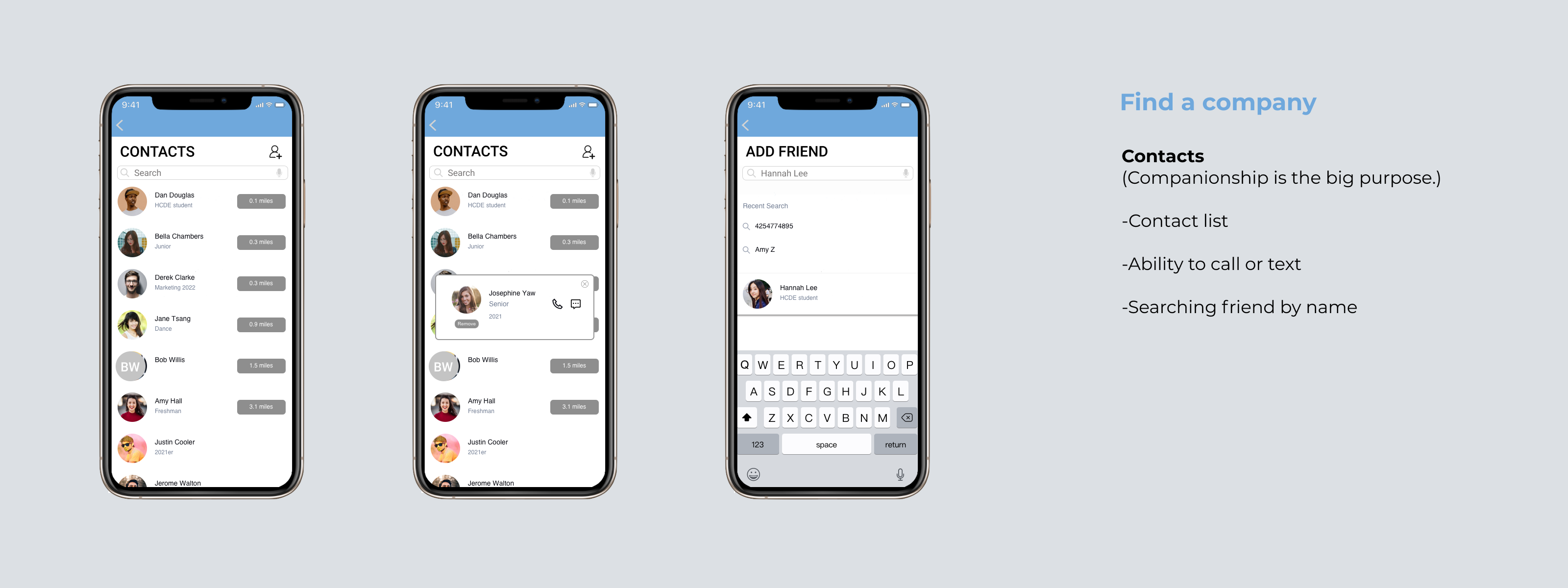
4. Allow users to have coordination with friends.
Besides that, we conclude the factors people mostly care about when they have to walk alone on the Ave.

Storyboard
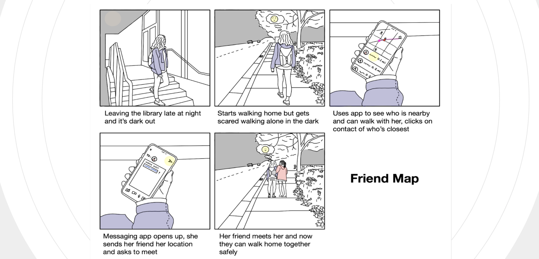
Once we finalized the design requirements, we constructed storyboards that simulate a possible scenario in which a user might interact with our product. Storyboards help contextualize when, how, and why a user could interact with our work. The storyboard helped us figure out the essential requirements in the making of the information architecture diagram.
Information Architecture
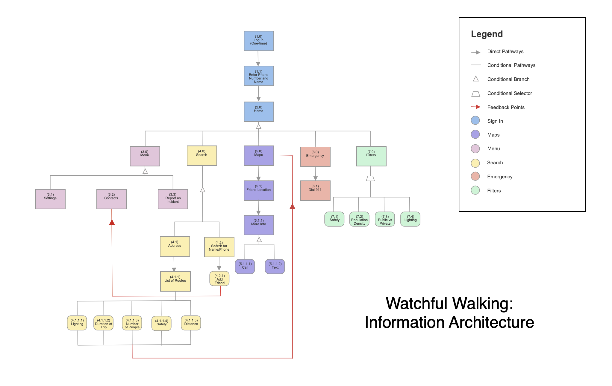
The information architecture diagram is a hierarchical structure that organizes the features of the product. Design requirements were translated into the app's necessary features and were then placed as branches of the information architecture tree. Collecting the required features in this way facilitated the making of our paper prototype by listing groups of features necessary for each screen.
Design
User Testing
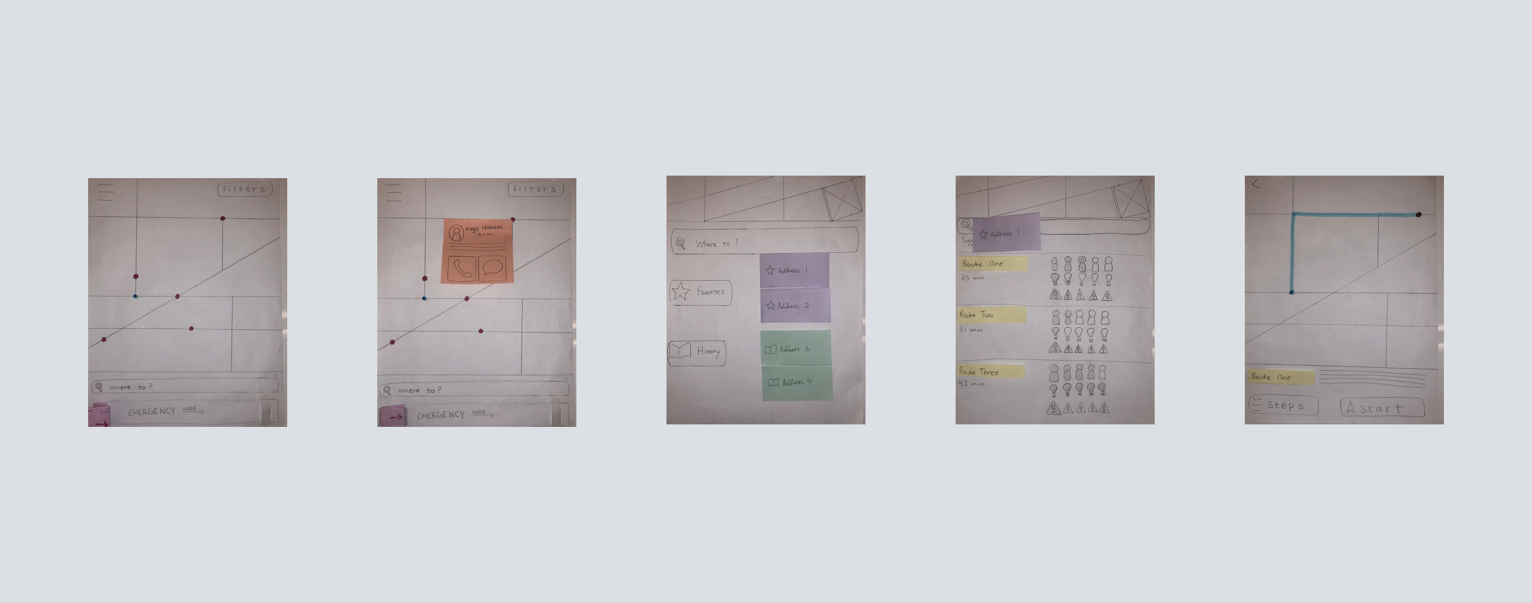
We conducted evaluative tests with people outside of the Human-Centered Design and Engineering department to evaluate our paper prototype's usability. We had each participant perform three tasks while they verbalized their thoughts about the process. After each member conducted a test, we compiled our findings and considered them when revising our product design to create wireframes.
Basic Evaluation Plan
Task 1 - Finding and contacting a friend using the map task scenario: It is 10 pm, and you are looking to find a friend to walk with you to a restaurant. Contact a friend nearby to see if they are willing to walk with you.
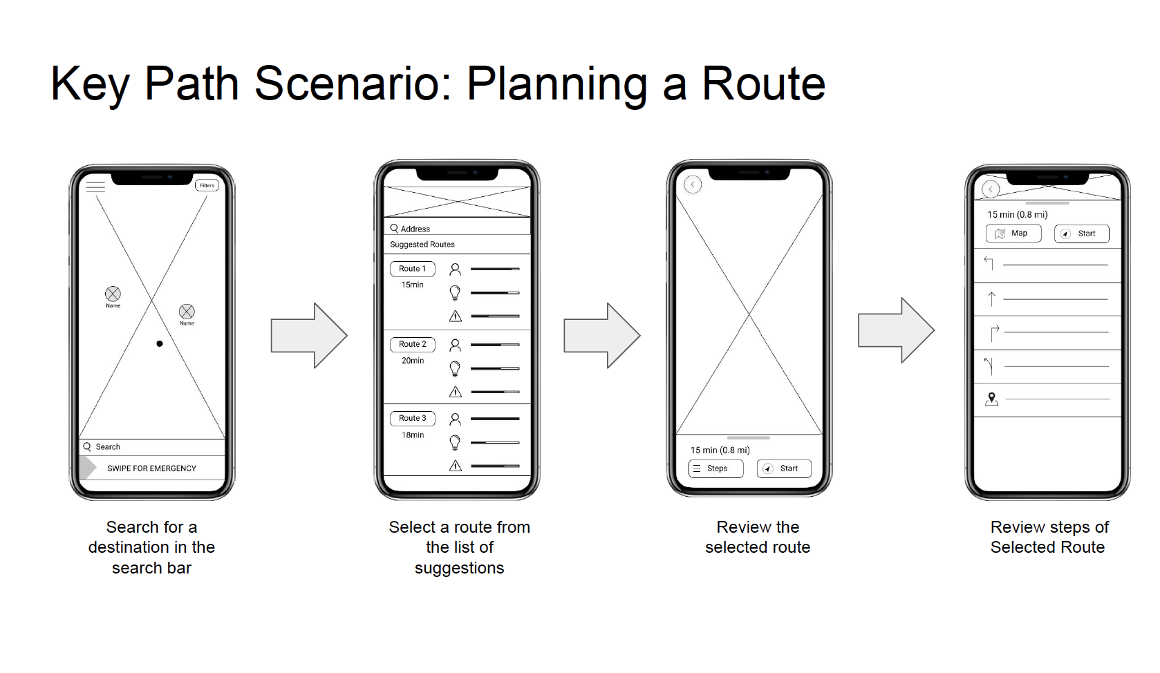
Task 2 - Planning a trip task scenario: You are hungry and try to figure out the best way to get to your favorite restaurant. Use the route planning feature to find the best route.
Task 3 - Contacting emergency services task scenario: You have finished studying and are walking home by yourself at night. You hear loud noises from a car and see two guys running away with a big bag. Make a quick emergency call using the app to notify authorities of the incident.
Finding 1 — Map Symbols are Ambiguous
Finding 2 — Multiple Opinions on How to Implement Emergency Button/Bar
Finding 3 — Dissatisfaction with the Current State of the Emergency Feature
Finding 4 — Route Description Icons Were Unclear
Wireframe
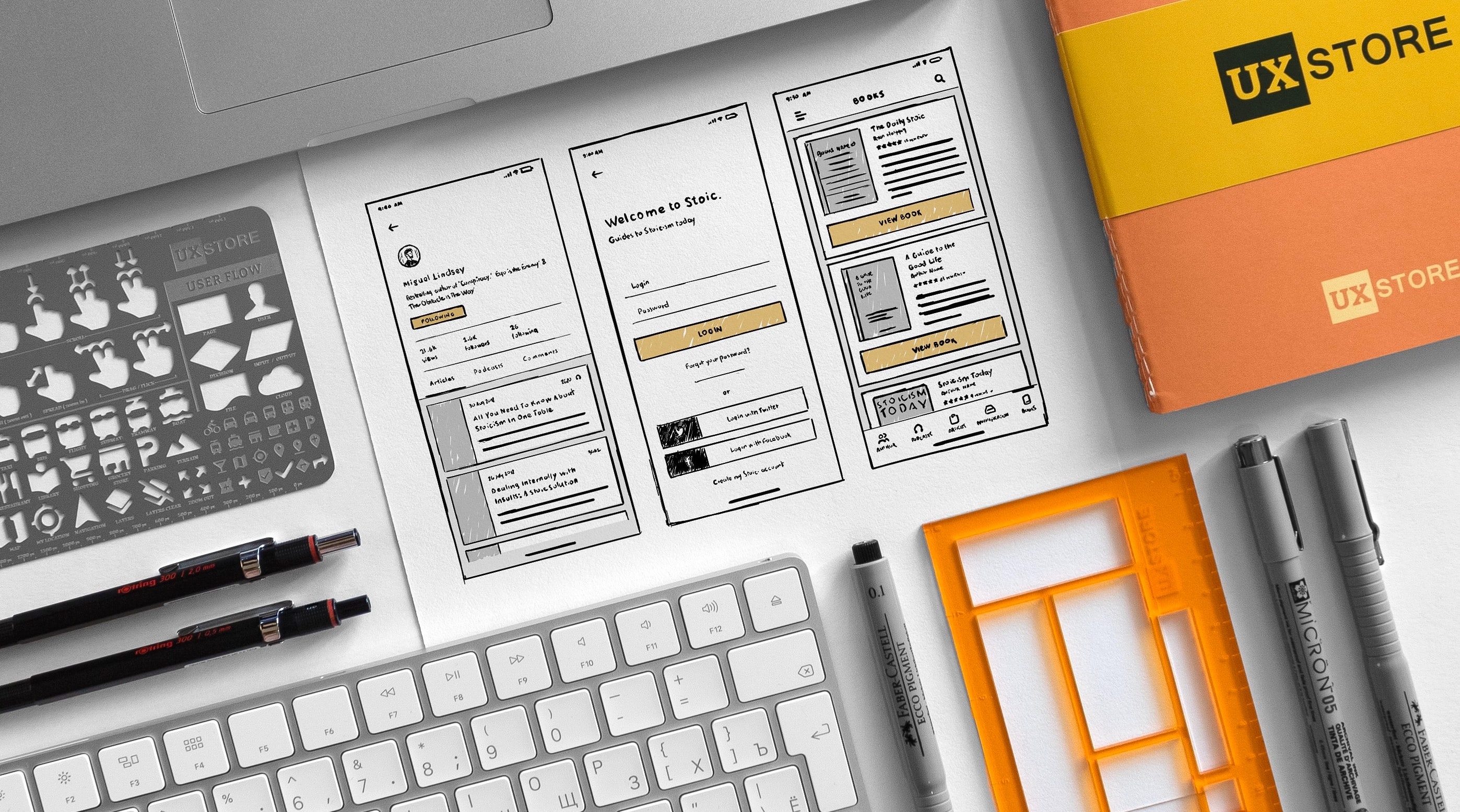
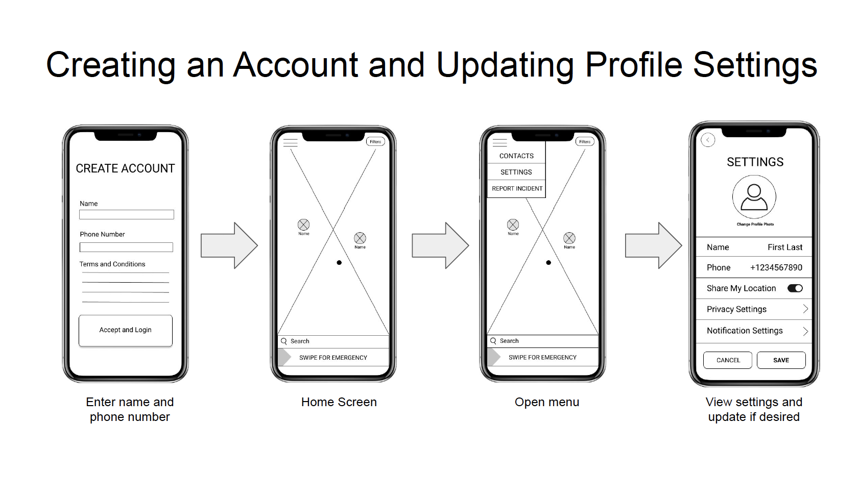
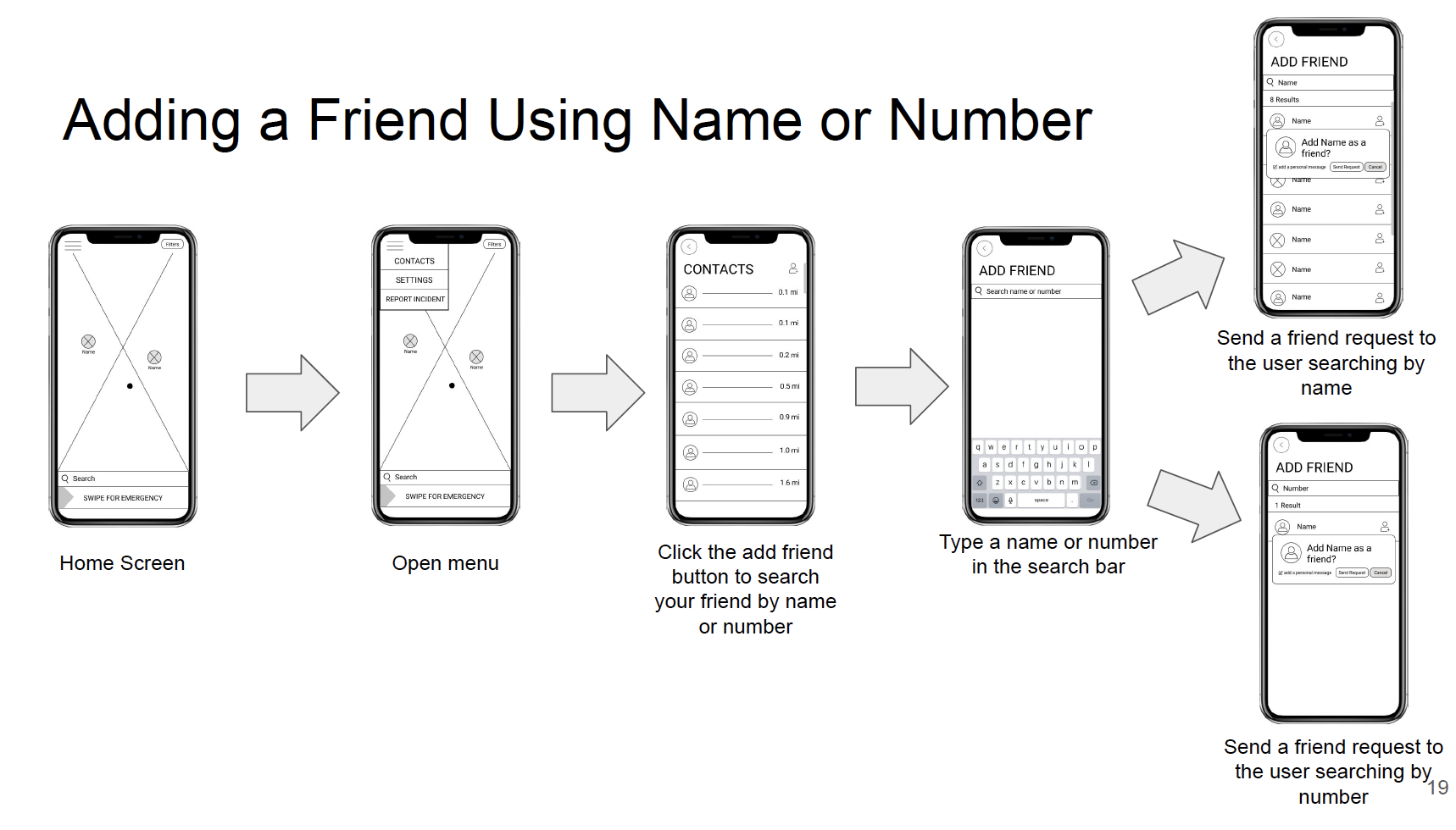
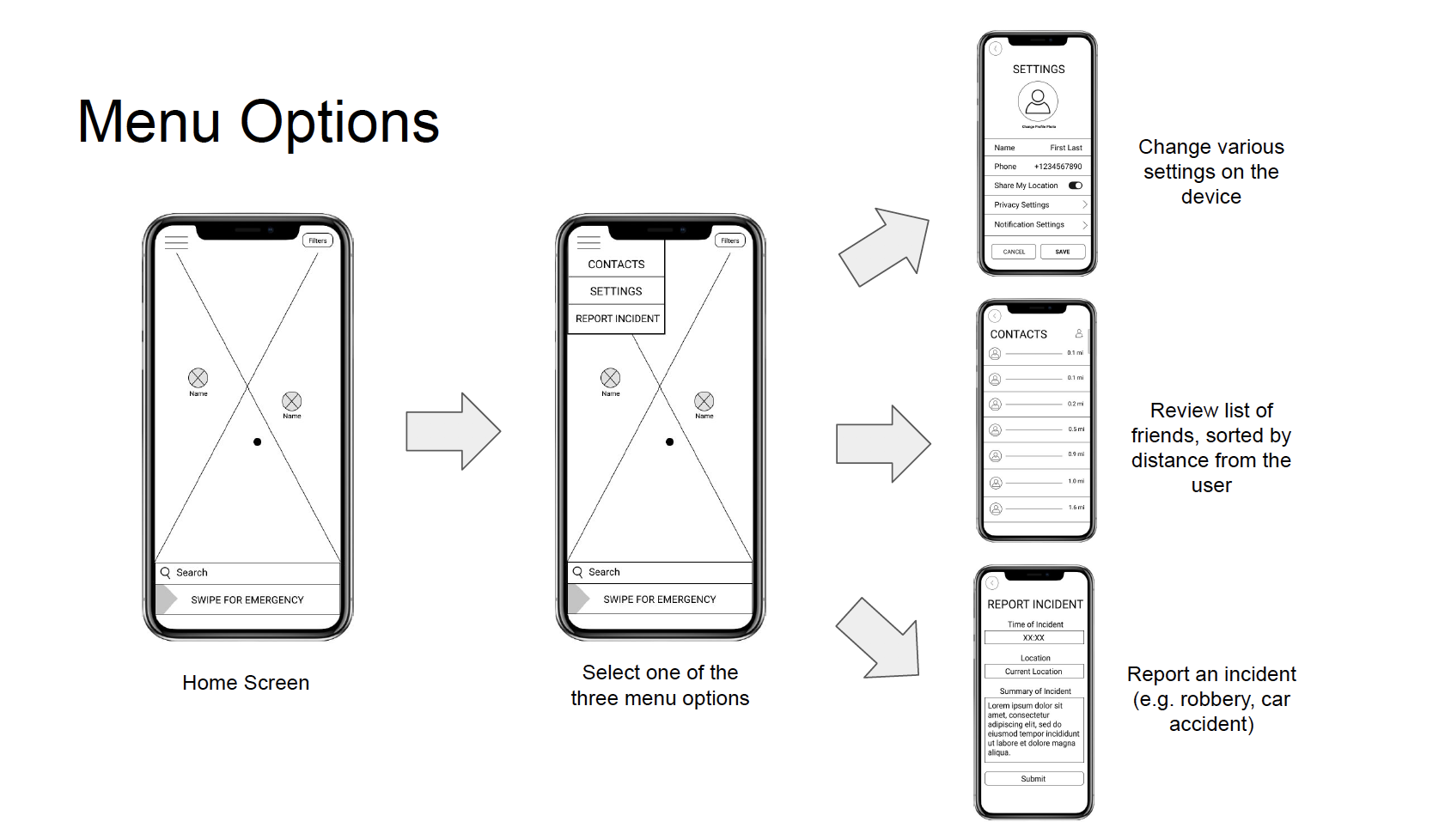
After our user testing, we optimized our design details and then constructed wireframes for the entire mobile app. Wireframes draft the visual layout of app screens without focusing too heavily on minor details. Feedback from the evaluative tests with our paper prototypes helped direct layout decisions. Each screen was annotated to clarify ambiguous aspects of the design. These wireframes served as a draft for our high-fidelity mockup screens.
High-fidelity Prototype
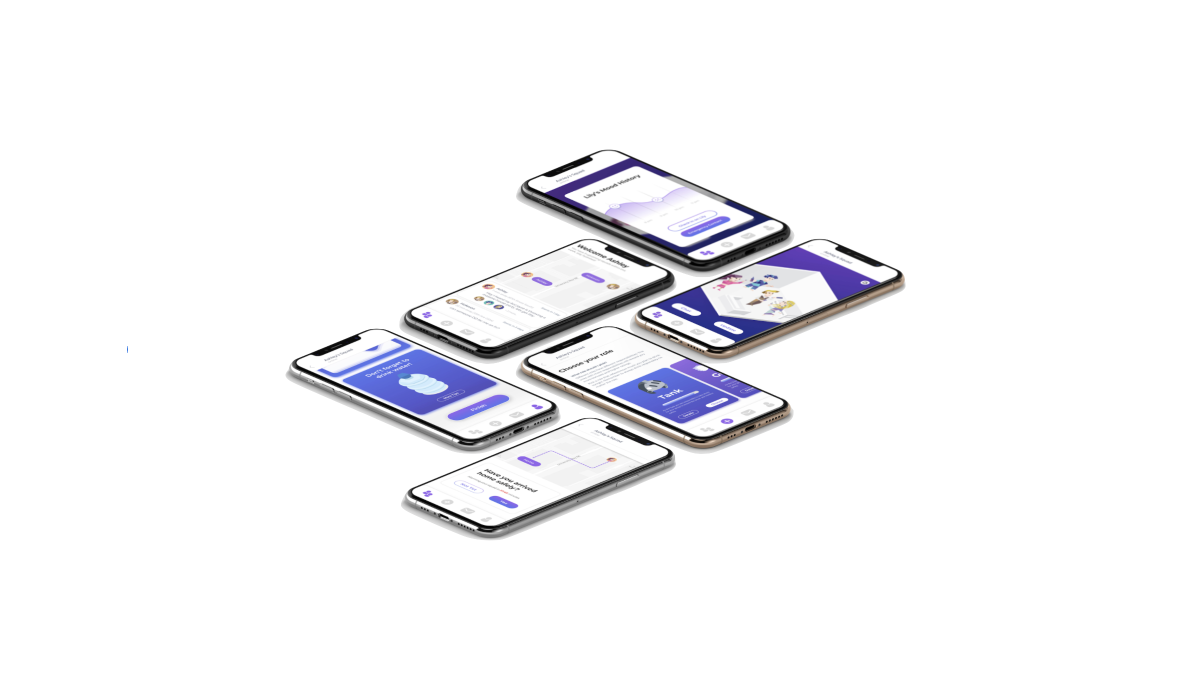
We culminated in the project by creating high-fidelity mockups of key screens in our app. These screens were our vision of what the final product will look like. Wireframe layouts were referenced in creating these mockups, and we referenced existing products such as Google Maps to guide our aesthetic decisions.
Reflection
Our Reflection
We should have used the extra time to iterate user research and explore different methods such as writing online surveys and shadowing potential users. This would have allowed us to have a deeper understanding of our users and reduce the number of assumptions we had to make to proceed with the project. Despite these challenges, however, we believe that we succeeded in this project in three ways:
1. We created a solution that supported all of the persona's needs and motivations.
2. Our polished projects were comparable in quality to examples that were given in terms of content and aesthetics.
3. Our final product was novel, incorporating features that don't exist in existing apps.
My Redesign
Why Redesign?
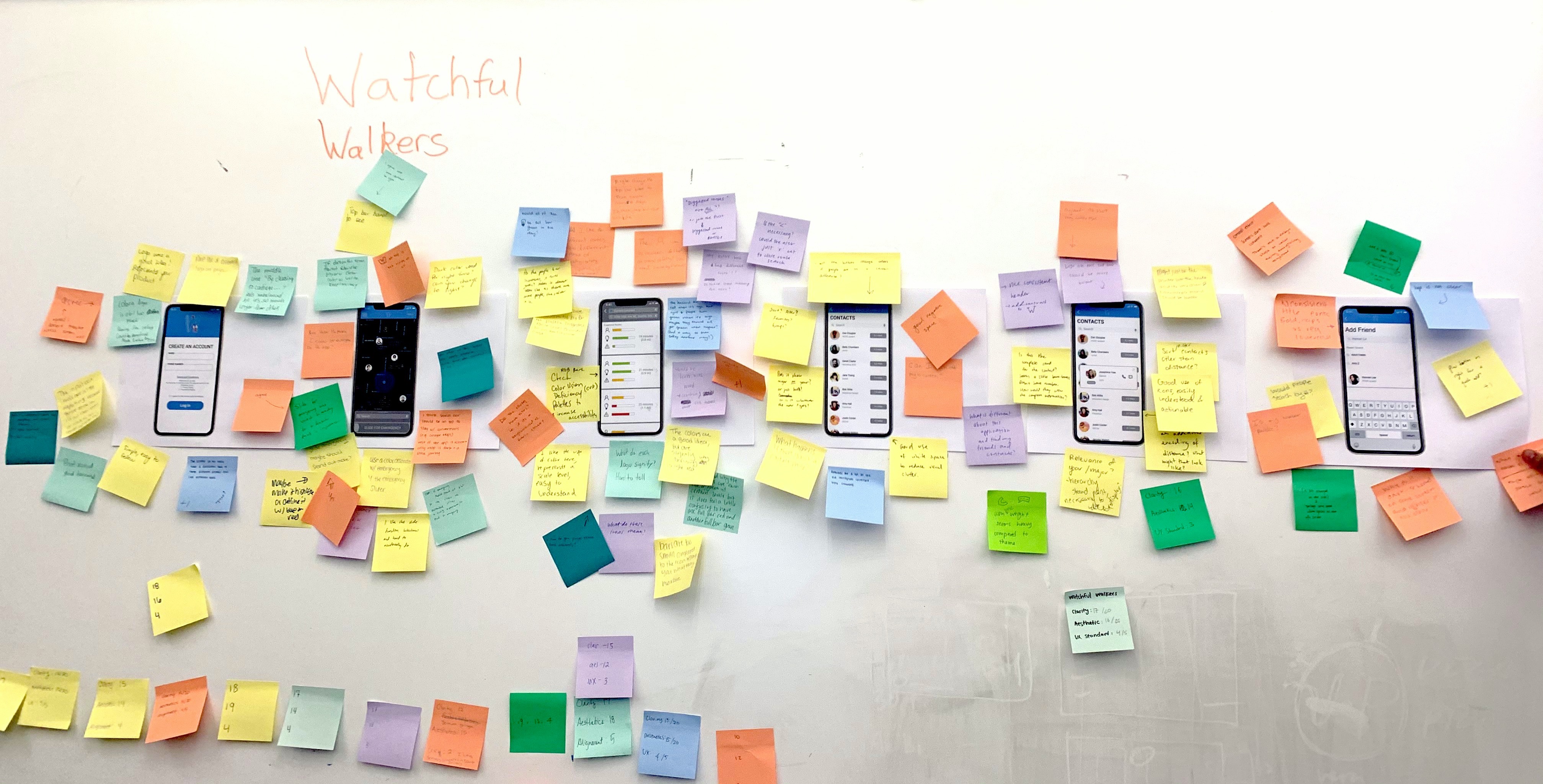
This project was completed a year ago. I decided to redesign the final prototype of the "watchful walker" project to better my design and mock up abilities.
Main unresolved feedback:
Feedback 1:
"I think the dark theme looks good. I probably will use this app at night. I want to see a more hi-fi version of it."
Feedback 2:
"I like the filter idea with the routes suggestion system. But when there is so much information being gathered and filtered, it is too much for users. It also seems not very technically realistic to gather and synthesize information about everything. How can the app visualize that into a progress part? I would suggest simplifying this feature."
Feedback 3:
"The emergency call is a really good idea but occupies too much space on the map. Could also cause me to misclick it."
Based on the feedback we get from the class, I aimed to optimized the following features:
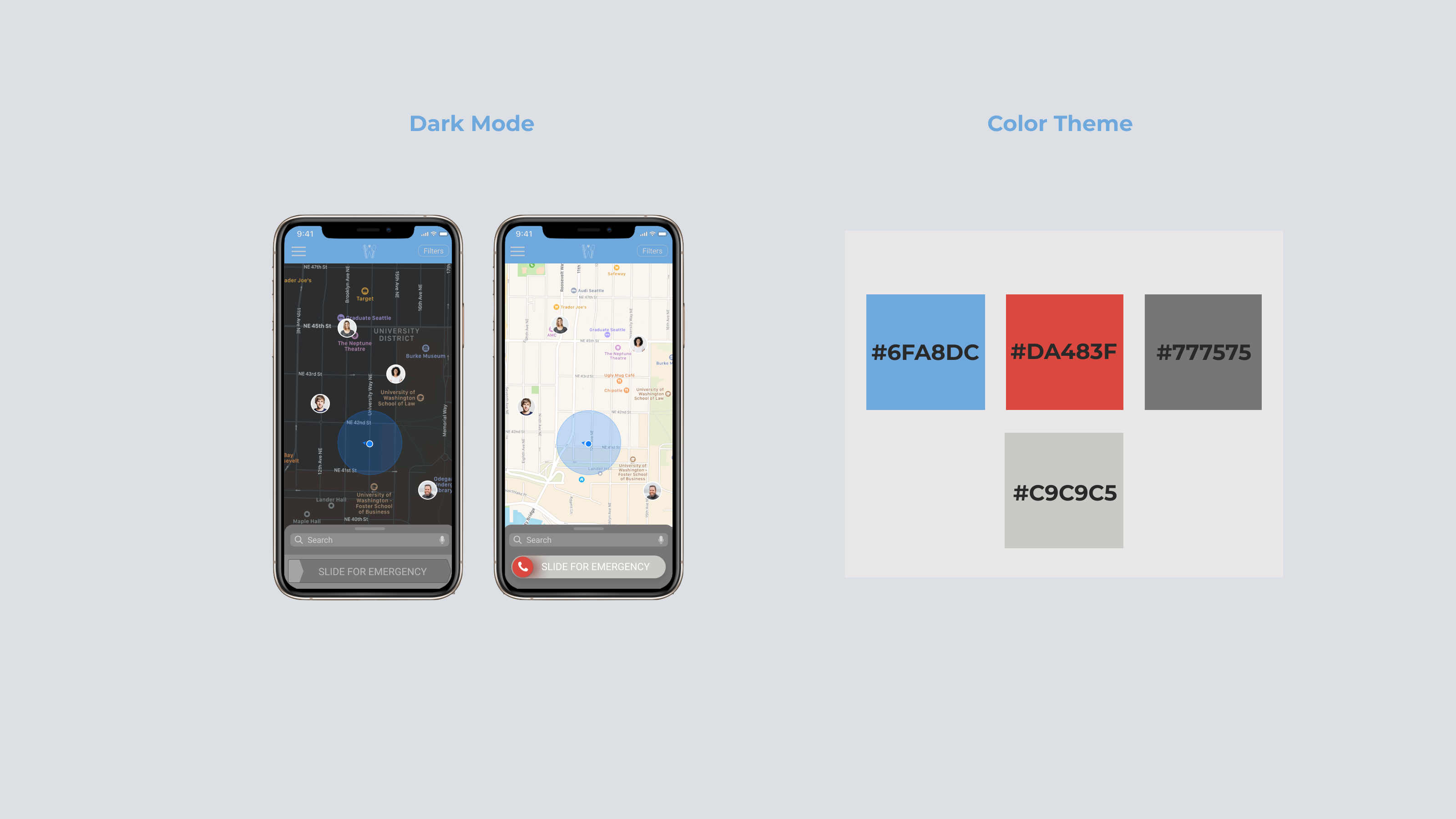
1 Student prefer to use the app at dark >>> Put dark mode as the default setting
2 Visualized and simpler route suggestion based on filter >>> Add sidebar for comparing routes
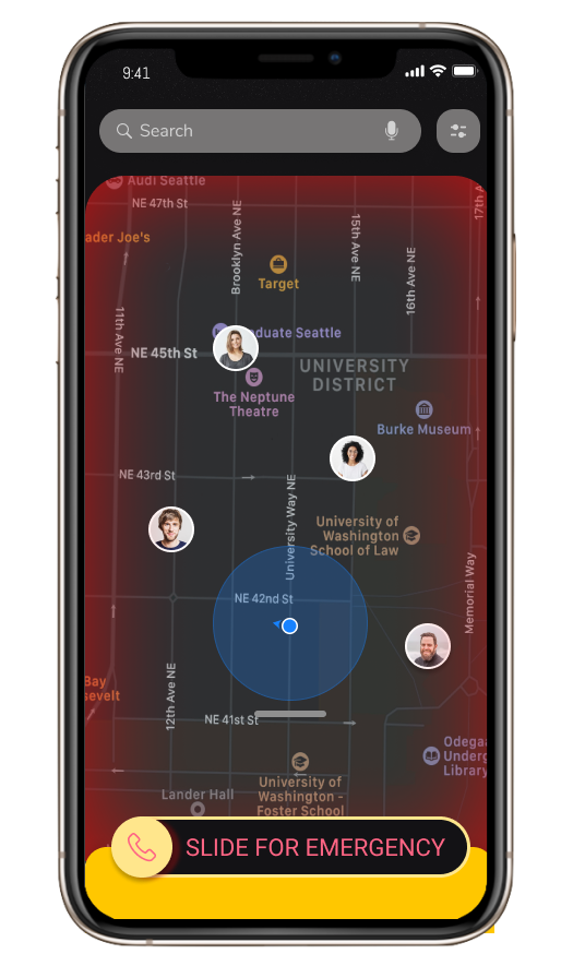
3 Simpler design for emergency calls >>> Hide on the left and add a red screen alert
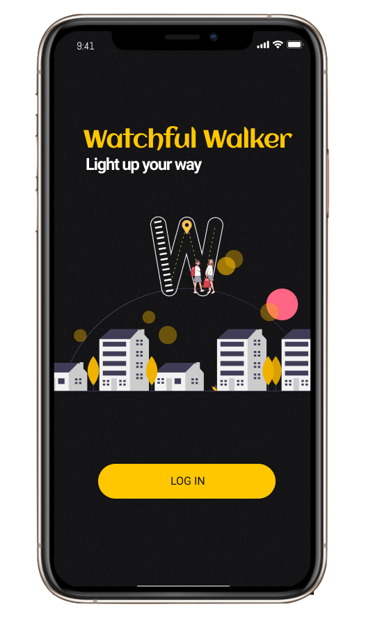
1. Dark Mode Theme
This design features a prominent color contrast. When users are walking home at night alone in the dark, the product will offer a sense of light and comfort.
APP FEATURES
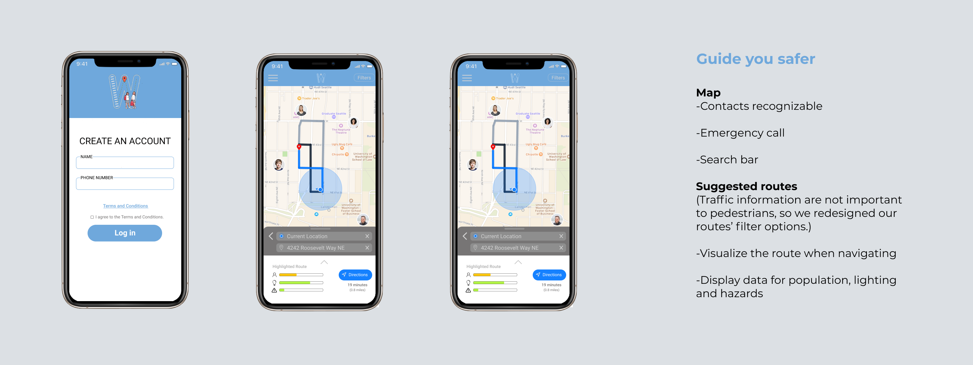
With this app, we provide the user company and a safe walking experience.

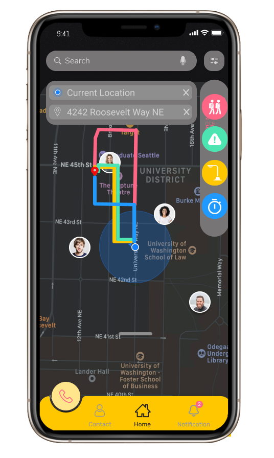
2. Simpler Routes Suggestion
The App was designed to be able to generate optimal routes for our users based on the four factors, population, brightness, safety, and time.
Factors' data was collected by our other users, UW alert and google maps.

3. Emergency Call
Screen Alert
To simplify the task bar, I made a touchable emergency button instead of a fixed button. I also added a visual alert effect on the map that will help make sure users do not end up "misclicking".


.png)
